切换外观
配图来源与生成说明
这些图用于帮助新人理解 Fold,均为设计示意,不是已实现产品的截图;精确协议以对应文档及其适用切片为准。
生成方式:内置 image_gen 工具。每张图单独生成,采用统一的纸张、线条与配色;最终图片随仓库保存,文档不依赖生成工具的缓存路径。
配图按篇、按章节嵌入正文,配图索引用于定位。需要精确字段、数值或行为定义时,以对应文档为准;原始设计草案不因配图而被改写。
图片与用途

旧版 05-budget-depth.png 保留作修订记录,已退出正文使用。它用面积块解释预算,容易在产品介绍阶段把 Fold 的用途限定为 Pinboard;当前 05 改用抽象的信息关系,提示词见本文末尾。
按讲述视角独立配图(17–19)
同一个概念在不同文档中承担不同解释任务。01 只用于项目总览,04 只用于 Skill 教学,05 与 07 只用于产品方向,11 只用于信息契约。数学稿移除重复的产品动机图,其余三处按状态结构、函数依赖和重放恒等式重新构图。索引与本资源页只链接图片和使用位置。
以下三张由内置 image_gen 分别生成,背景不透明,未使用输入参考图。每段保存一次完整调用提示词。
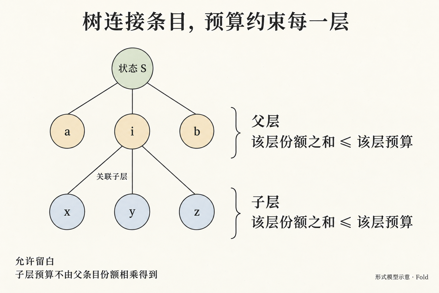
17-layer-budget-tree
text
Use case: scientific-educational.
Asset type: an original raster explanatory figure for the Chinese mathematical design document of Fold.
Art direction: warm off-white paper with very subtle grain, fine charcoal ink, restrained pale sage for state, amber for semantic estimation, slate blue for evidence. Crisp dark text, very readable Simplified Chinese labels, spacious precise diagram. Flat editorial scientific illustration; keep the calm palette of the documentation, but create a wholly new composition for the formal relationships described below. No product UI, boards, area tiles, cards, dashboards, screens, people, robots, plants, coffee, physical props, fictional measured data, percentages or decorative equations. Approximately 3:2 landscape. Generous margins. Only the specified meaningful text. Opaque background. Small bottom-right caption “形式模型示意 · Fold”.

Purpose: explain that the structured state is a tree, and budget constraints apply separately within each layer. This is a structural relationship figure, not a visual allocation of screen area and not a general illustration of reading more detail.
Title exactly “树连接条目,预算约束每一层”.
Draw a sparse rooted tree on the left two-thirds, with enough vertical space for two layers. A small top root labelled “状态 S” connects to three identical-size circular entry nodes a, i, b across the first row. The middle node i alone connects downward to three identical-size circular entry nodes x, y, z across the second row. Use all nodes the same size; colors distinguish relationships only. No other branches or nodes. A tree line expresses structural containment, never flow of attention amounts. Keep the parent i node visually clear.
A thin open brace beside the first row groups just a, i, b and connects to a short statement on the right headed “父层”, followed by the readable relation “该层份额之和 ≤ 该层预算”.
Another separate open brace beside the second row groups just x, y, z and connects to a statement directly below headed “子层”, followed by the same readable relation “该层份额之和 ≤ 该层预算”.
Near the edge from i toward x/y/z, one short annotation “关联子层”. Do not put the child-layer budget inside the node i. Do not enclose any node or group in rectangles. Do not draw budget amounts flowing or being multiplied along edges.
Bottom left two short notes, exactly “允许留白” and “子层预算不由父条目份额相乘得到”.
The key visible lesson is two separate local inequalities on a finite tree. No concrete allocation values, no treemap rectangles, no percentage areas. Chinese inequality text must stay on one line each and remain large. The tree and braces must not overlap labels.
18-estimation-dependencies
text
Use case: scientific-educational.
Asset type: an original raster explanatory figure for the Chinese mathematical design document of Fold.
Art direction: warm off-white paper with very subtle grain, fine charcoal ink, restrained pale sage for state, amber for semantic estimation, slate blue for evidence. Crisp dark text, very readable Simplified Chinese labels, spacious precise diagram. Flat editorial scientific illustration; keep the calm palette of the documentation, but create a wholly new composition for the formal relationships described below. No product UI, boards, area tiles, cards, dashboards, screens, people, robots, plants, coffee, physical props, fictional measured data, percentages or decorative equations. Approximately 3:2 landscape. Generous margins. Only the specified meaningful text. Opaque background. Small bottom-right caption “形式模型示意 · Fold”.

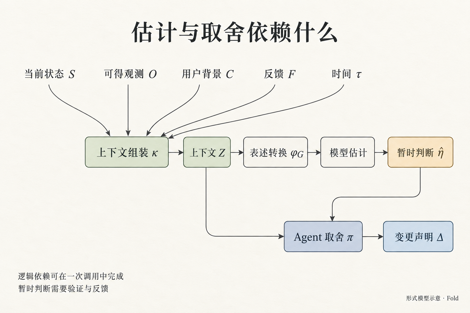
Purpose: show the dependency structure of context assembly, skill-guided formulation, temporary semantic estimation, and the Agent's change proposal. This must be a mathematical dependency figure, distinct from a before/after story about an article and a meeting.
Title exactly “估计与取舍依赖什么”.
Use a clean top-to-bottom composition with three bands, clear arrowheads, minimal thin open outlined nodes, and generous separation:
TOP BAND: five equal plain text input labels in one horizontal row: “当前状态 S”, “可得观测 O”, “用户背景 C”, “反馈 F”, “时间 τ”. From EACH label, a thin arrow points downward into one shared node “上下文组装 κ” at the center-left of the middle band.
MIDDLE BAND: left-to-right chain starting from that assembly node: “上下文组装 κ” → “上下文 Z” → “表述转换 φG” → “模型估计” → “暂时判断 η̂”. Use an actual hat over eta if possible; the Chinese label is essential and must be exact. Each arrow direction is left to right. There must be only one assembly node and one Z node.
BOTTOM BAND: place the node “Agent 取舍 π” below the middle/right area, and “变更声明 Δ” to its right. Two distinct dependencies enter Agent 取舍 π: one arrow descends from the actual “上下文 Z” node and routes cleanly beneath the middle chain into π from the left; the other arrow descends from “暂时判断 η̂” and enters π from above/right. Then π → Δ clearly. The Z-to-π dependency must NOT go through model estimation; both Z and the temporary estimate inform the proposal.
Do not add an arrow from inputs directly to Δ, and do not connect Δ to any automatic optimization or truth node.
Bottom-left note exactly “逻辑依赖可在一次调用中完成”.
Second short note exactly “暂时判断需要验证与反馈”.
Use colors only to distinguish given context, estimated judgment and proposed changes. No numeric scoring, service containers, server icons, source verification marks or confidence badges. A logical dependency graph does not prescribe multiple model calls or a fixed importance algorithm. Ensure all five input arrows end at κ, not Z or other nodes.
19-ordered-event-replay
text
Use case: scientific-educational.
Asset type: an original raster explanatory figure for the Chinese mathematical design document of Fold.
Art direction: warm off-white paper with very subtle grain, fine charcoal ink, restrained pale sage for state, amber for semantic estimation, slate blue for evidence. Crisp dark text, very readable Simplified Chinese labels, spacious precise diagram. Flat editorial scientific illustration; keep the calm palette of the documentation, but create a wholly new composition for the formal relationships described below. No product UI, boards, area tiles, cards, dashboards, screens, people, robots, plants, coffee, physical props, fictional measured data, percentages or decorative equations. Approximately 3:2 landscape. Generous margins. Only the specified meaningful text. Opaque background. Small bottom-right caption “形式模型示意 · Fold”.

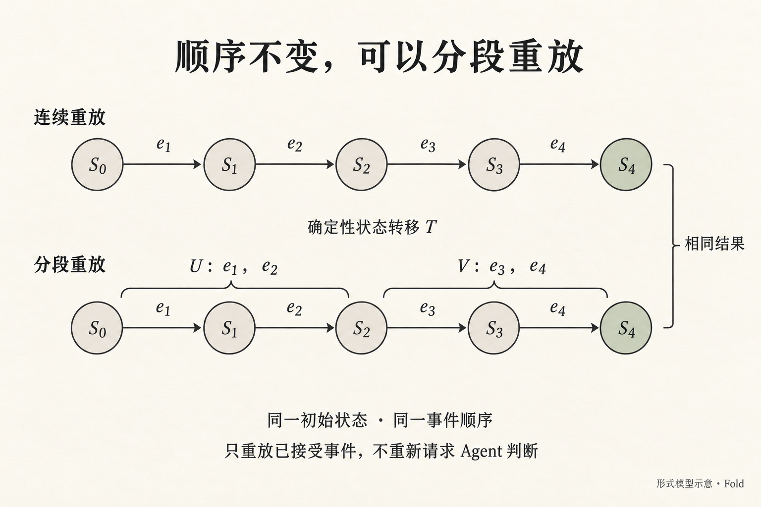
Purpose: explain deterministic ordered state replay and its equivalence under segmentation. This is not a picture of two input/output journals and not a semantic estimation pipeline.
Title exactly “顺序不变,可以分段重放”.
Draw TWO parallel horizontal state-transition chains with the same five equally sized circular state nodes S₀, S₁, S₂, S₃, S₄, left to right. Exactly five states and four transitions per row. Every transition arrow points RIGHT and has the exact event label above it in order e₁, e₂, e₃, e₄. Keep state labels centered inside circles and event labels above their arrows, never overlapping.
Top row label at the left margin above the chain: “连续重放”.
Bottom row label at the left margin above the chain: “分段重放”.
On the lower row, one thin brace ABOVE the first two event transitions labels the segment “U:e₁,e₂”. A separate brace ABOVE the last two event transitions labels “V:e₃,e₄”. The segment boundary is exactly at S₂. Do not add another S₂ or duplicate any event. Both paths start from the same S₀ and end in S₄. Emphasize S₄ in muted sage on both rows.
At the right of both ending states, a simple light bracket relates them to the short statement “相同结果”. This bracket is an equality/comparison, not an arrow feeding state from one row to another.
Between the rows, a small isolated label “确定性状态转移 T”, with no extra transition arrow.
Below the diagram, two readable notes exactly: “同一初始状态 · 同一事件顺序” and “只重放已接受事件,不重新请求 Agent 判断”.
No raw observations, no model icon, no event reordering, no random choices, no live wall clock, no actual application screens, no rejection branch. This figure illustrates the fold segmentation identity for one already valid accepted-event history; it does not imply the semantic judgment that produced the events was deterministic. Keep all subscripts legible and accurate.
最初生成提示词(01–06)
每次新图调用的完整提示词由下方“共用风格”原文与对应的“单图要求”原文直接拼接。背景不透明,未使用输入参考图。
共用风格
text
Use case: infographic-diagram.
Asset type: a finished raster illustration for Chinese-language Fold design documentation, not a screenshot of an implemented product.
Shared art direction: a thoughtful editorial field guide on warm off-white paper, fine charcoal ink outlines, pale sage green for structured state, muted amber for human attention and context, pale slate blue for incoming sources. Flat diagram illustration with tiny paper-fold details, generous whitespace, exceptionally readable Simplified Chinese sans-serif labels, a few large meaningful drawings. Sophisticated and calm, not a corporate dashboard or a flashy AI advertisement. Wide landscape composition roughly 3:2 at high resolution. Large text remains readable at documentation width. No microscopic text, no fake code, no illegible filler, no extra slogans, no branded logos, no decorative equations, no 3D robots, no glowing brains. Render the specified text accurately and only where useful. Bottom corner small caption: “概念示意 · Fold”.
01-fold-overview
text
Primary request: create a welcoming visual overview of the complete Fold system for a first-time reader.
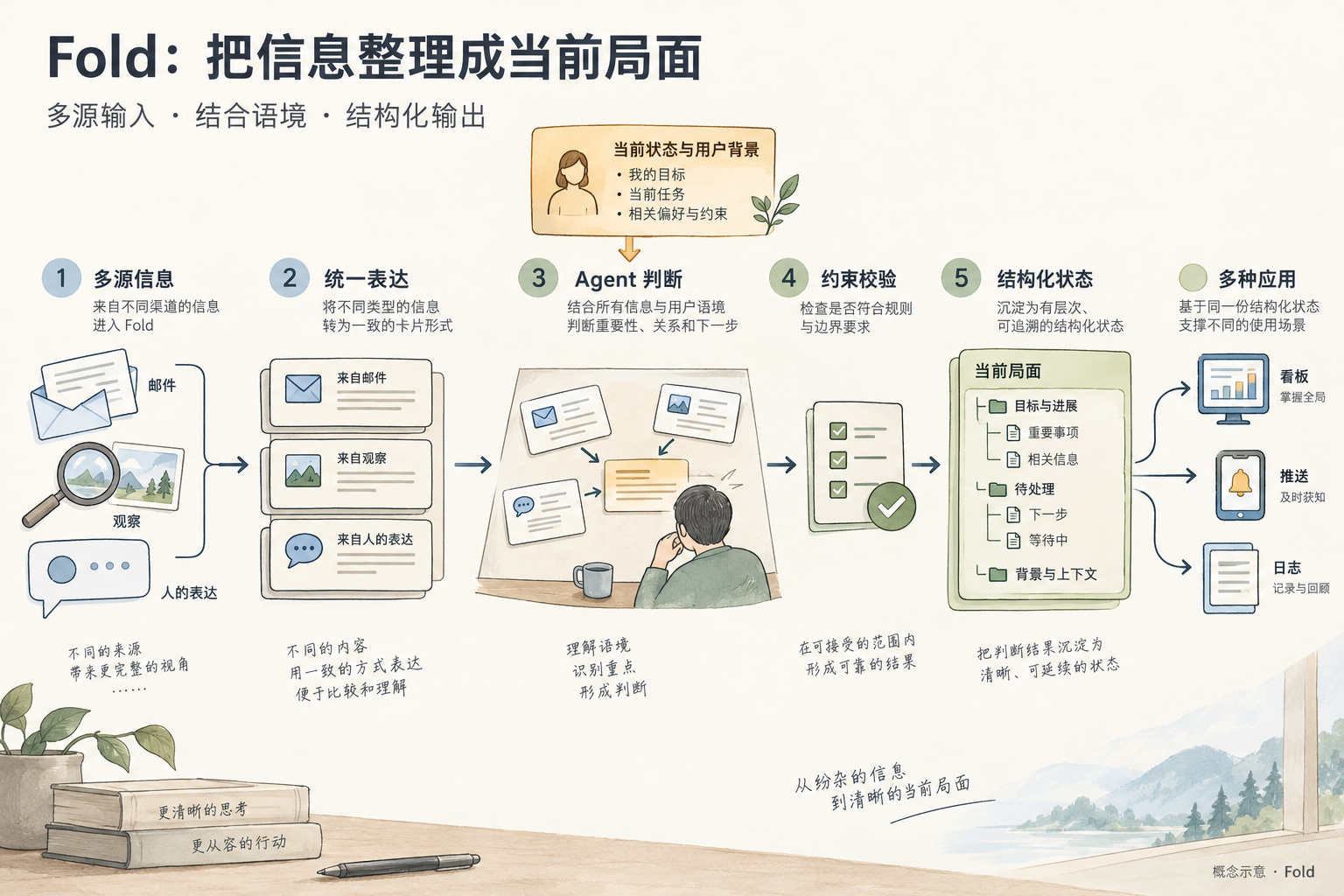
Composition: a clear left-to-right main flow with five labeled stages and one input above the center. Stage 1 shows three simple paper-like source drawings: envelope, observation magnifying glass, and human speech bubble, collectively labeled “多源信息”. Stage 2 an orderly stack of matching cards labeled “统一表达”, each visually retaining its own small source icon. Stage 3 a paper workspace where cards are compared, labeled “Agent 判断”. Above this workspace, a small amber card “当前状态与用户背景” feeds into this stage with an unambiguous downward arrow. Stage 4 a small outlined checking gate labeled “约束校验”. Stage 5 one clean sage nested card tree labeled “结构化状态”, then three short branching arrows to an area at right labeled “多种应用”, with three labeled icons “看板”, “推送”, “日志”.
Title top left exactly “Fold:把信息整理成当前局面”.
Optional single short subtitle exactly “多源输入 · 结合语境 · 结构化输出”.
All main arrows flow left to right; the context arrow points into Agent 判断. Keep the lower half airy. Structured state is the shared source for all three applications; do not draw sources directly sending notifications. Importance decisions happen at Agent 判断; the check gate only checks constraints. This is a conceptual explanatory illustration, not a frozen architecture or complete UI.
02-human-agent-loop
text
Use case: illustration-story.
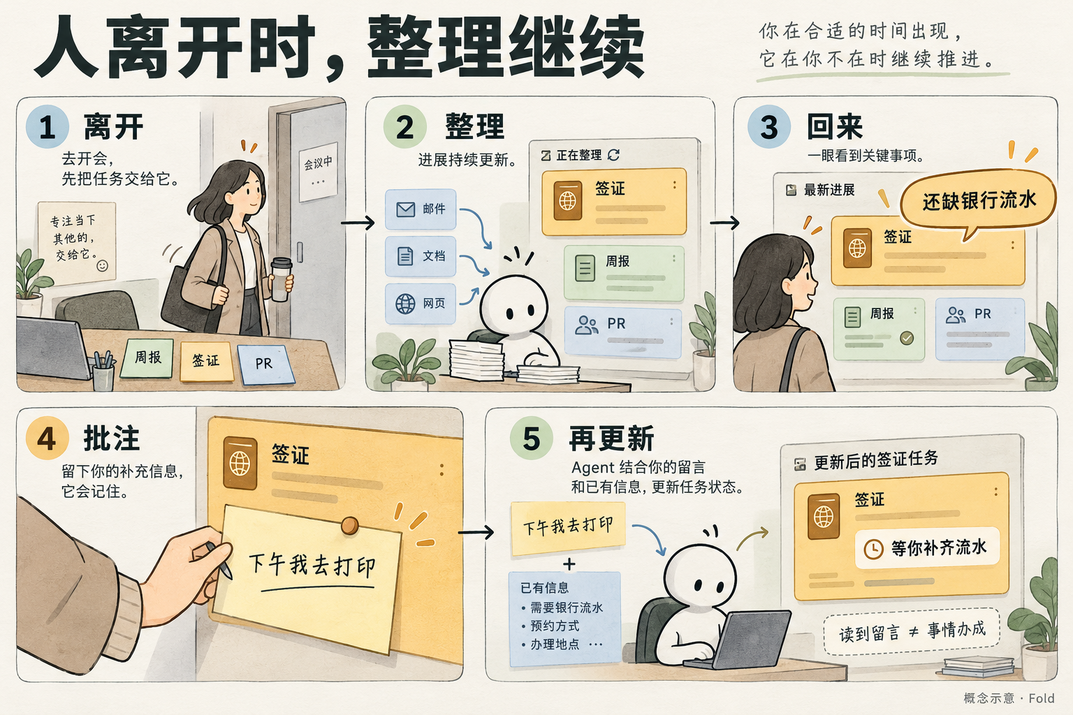
Primary request: a five-scene narrative infographic explaining asynchronous human-Agent collaboration, with the same simple illustrated office worker in the human scenes. This is an explanatory comic, not a product mockup.
Composition: five spacious sequential scenes in a flowing two-row arrangement, connected by thin clear arrows and numbered 1 through 5. Top row scenes 1, 2, 3; bottom row scenes 4, 5 in left-to-right reading order with unmistakable connecting arrow. Large Chinese title “人离开时,整理继续”.
Scene 1 label “1 离开”: person heading into a meeting, leaving a desk with three task notes. Tiny task notes use only “周报”, “签证”, “PR”.
Scene 2 label “2 整理”: report notes converge into a calm board, large amber visa card, medium sage report card, smaller PR card. The person is absent. Exact short caption “进展持续更新”.
Scene 3 label “3 回来”: same person looks at the board and immediately notices visa card. Large callout exactly “还缺银行流水”.
Scene 4 label “4 批注”: close view of handwritten user note pinned to the visa card, exact text “下午我去打印”.
Scene 5 label “5 再更新”: Agent workspace compares the user note and task facts, updates a visa summary card. Exact text “等你补齐流水”. Small readable caption “读到留言 ≠ 事情办成”.
Story lesson: the person visits only when convenient, work and reporting continue asynchronously; saved feedback is not a claim of action completion. Do not show completed payment, booking confirmation or all tasks finished. Keep illustrations concrete and light, labels large, no dense paragraphs.
03-input-output
text
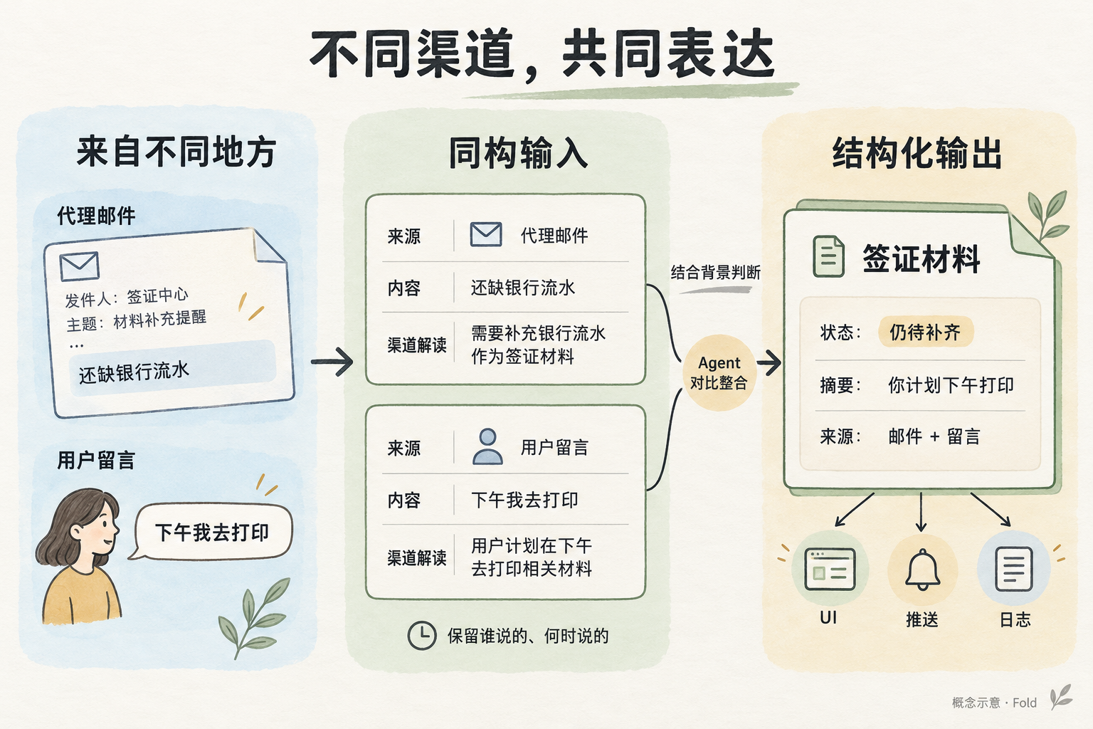
Primary request: a concept infographic that teaches the difference between raw source information, normalized observations, and the shared structured output.
Composition: landscape with three generous columns separated by simple arrows. Title exactly “不同渠道,共同表达”.
Left column heading “来自不同地方”, show an email paper and a human speech bubble. Email label “代理邮件”, message text “还缺银行流水”. Human label “用户留言”, message text “下午我去打印”.
Middle column heading “同构输入”, show TWO separate equally shaped cards. Both have the identical three visible row labels “来源”, “内容”, “渠道解读”. The first carries a tiny envelope source icon; the second a person source icon. Do not merge these cards yet. A small note below reads exactly “保留谁说的、何时说的”.
Right column heading “结构化输出”, show ONE large nested-outline state card with a small source-link line connecting to BOTH middle observation cards through a small central Agent comparison mark. Large title inside state card “签证材料”. Rows: “状态:仍待补齐”, “摘要:你计划下午打印”, “来源:邮件 + 留言”. Below the state card are three light icons labeled “UI”, “推送”, “日志” linked outward from this same card.
Below the middle-to-right arrow, label “结合背景判断”.
Important semantic invariants: normalize format without certifying truth; user plan is not completed action. Exactly two normalized input cards and one output card; the source identities remain visible. No checkmark next to the user's printing plan, no fabricated task completion, no literal schema or JSON brackets; this is a teaching concept illustration.
04-context-estimation
text
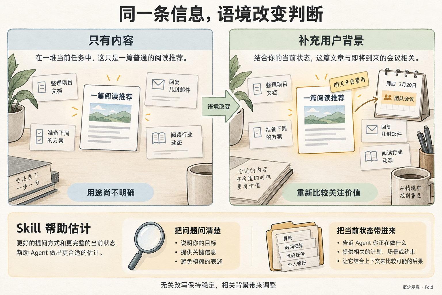
Primary request: an educational comparison illustration showing how LLM estimation gains value from context, and how skill helps with wording and context, without depicting a fixed scoring algorithm.
Composition: two equally sized side-by-side panels, connected only by a small central context-change arrow; a slim instructional strip at the bottom. Title exactly “同一条信息,语境改变判断”.
Left panel heading “只有内容”. It shows an article card labeled “一篇阅读推荐” surrounded by other current task cards; the article has modest emphasis, no numerical score. Beneath it a readable note “用途尚不明确”.
Right panel heading “补充用户背景”. The SAME article card is now accompanied by an amber user note exactly “明天开会要用”. The article's relevance is highlighted by a connection to a small meeting-calendar icon, while other tasks remain visible. Beneath it a note “重新比较关注价值”. Do not declare it always the highest priority or a fixed larger share.
Bottom strip heading “Skill 帮助估计”. Two visual tools side by side: a wording lens labeled “把问题问清楚”, and a context folder labeled “把当前状态带进来”.
Small footer sentence above standard concept caption: “无关改写保持稳定,相关背景带来调整”.
No percentages, no importance score, no big mathematical brain. Express that the Agent compares consequences and current state, not that the wording itself changes ground truth.
05-budget-depth
text
Primary request: a clear visual explanation of local attention budget, whitespace, and an independently budgeted child layer, for readers of a mathematical design document.
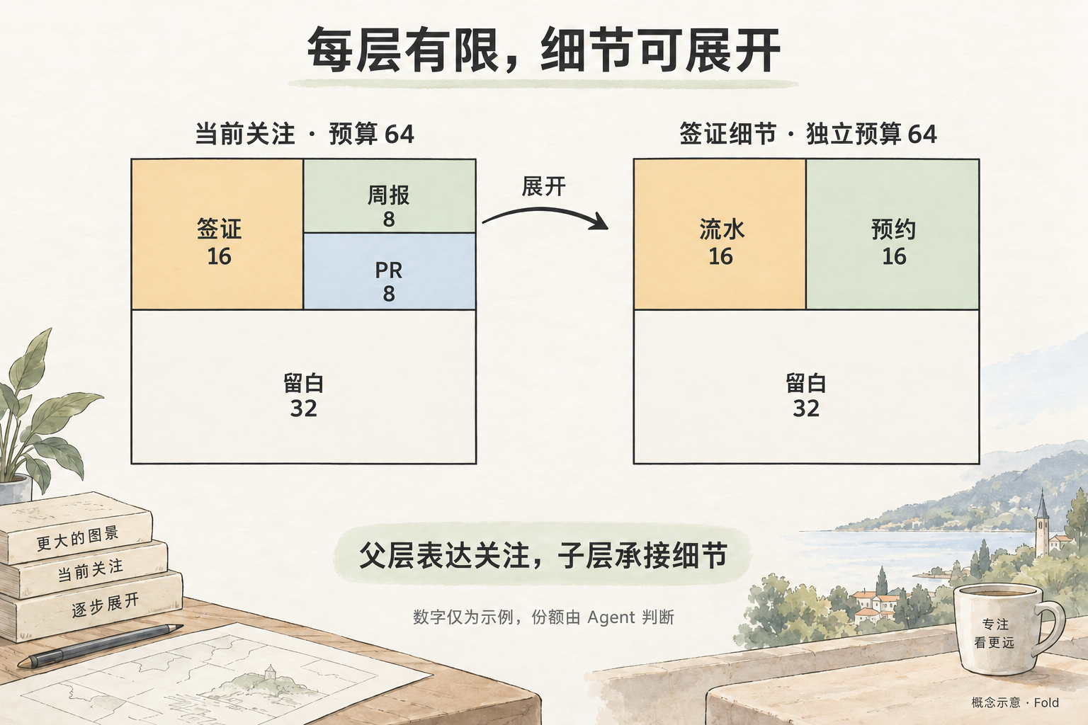
Composition: two large 8 by 8 square grids side by side, with a curved arrow from the “签证” region in the left grid to the WHOLE right grid, labeled “展开”. Title exactly “每层有限,细节可展开”.
Left grid label “当前关注 · 预算 64”. Precisely partition the 8x8 grid as follows: a 4 columns by 4 rows amber top-left block labeled “签证 16”; a 4 by 2 pale-sage top-right block labeled “周报 8”; a 4 by 2 slate-blue block directly below the top-right block labeled “PR 8”; a full-width 8 by 4 lower region intentionally empty off-white, labeled “留白 32”. Thin grid lines remain visible. This sums to 16 + 8 + 8 + 32 = 64. Keep the 8 columns and 8 rows count accurate; do not add other cards.
Right grid label “签证细节 · 独立预算 64”. Precisely partition into two 4x4 blocks across the top half and one 8x4 bottom half: amber top-left “流水 16”; sage top-right “预约 16”; off-white empty bottom half “留白 32”. This child also has 64 cells; parent visa's 16 is NOT multiplied into child sizes. All drawn shapes align to the given grid.
Between or below diagrams a short exact caption “父层表达关注,子层承接细节”.
Bottom exact note “数字仅为示例,份额由 Agent 判断”.
No urgency badge, no completed-action marks, no proportional mini-board inside the left parent area. Ensure generous margins and readable text.
06-time-meaning
text
Primary request: a two-lane explanatory illustration distinguishing action deadline from information expiry.
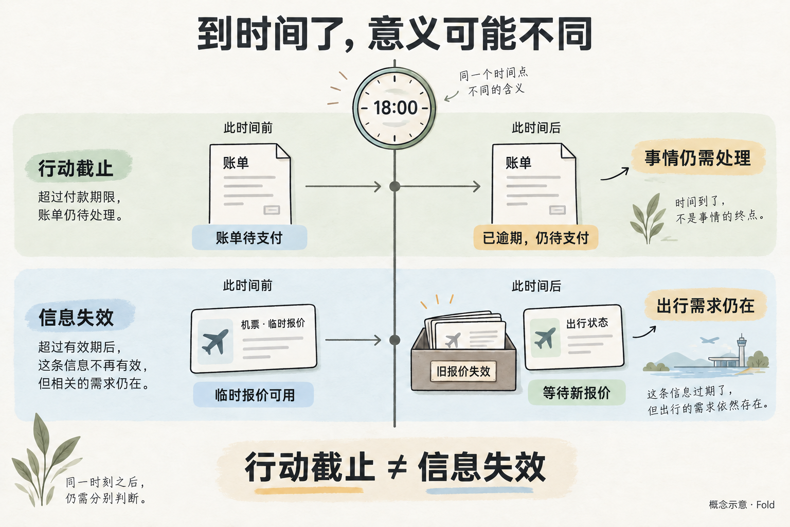
Composition: large title “到时间了,意义可能不同”. A single central clock labeled “18:00” aligns with a vertical time marker crossing two horizontal lanes. Each lane flows left to right from before the time to after it.
Top lane: paper bill icon before the line labeled “账单待支付”. After the line, the SAME bill remains visible, now with an amber label “已逾期,仍待支付”. A short caption at the lane end says “事情仍需处理”. Do not show the bill deleted, faded away or completed.
Bottom lane: airplane quote card before the line labeled “临时报价可用”. After the line, an old quote card moves to a small archive tray labeled “旧报价失效”, while a new travel-status card remains visible labeled “等待新报价”. Short caption at lane end “出行需求仍在”.
Below lanes, a readable sentence exactly “行动截止 ≠ 信息失效”.
Visual goal: the same clock time can require different semantic interpretations. An expiry does not automatically erase the whole subject. Do not imply the compiler decides importance from dates, or that everything past a date is removed. No prices or invented numerical consequence. Crisp large Chinese labels, gentle matter-of-fact tone.
维护约定
每张图只在一个正文位置使用,围绕该段的讲述任务构图;本页和索引通过链接定位。更改图中概念时,同步维护正文与说明。数值、箭头与关系应逐项核对,不能只凭生成完成判断正确;若做定向修订,在这里保留修订提示词。图像的风格与示意数值不是产品界面规范。
图片与同一处的文字、公式或 Mermaid 可以重复解释相同内容,便于人和 LLM 理解。保留关键定义与关系的可读表达,核对各种表达中的语义、数值和条件;不因信息冗余而删去必要说明。
定向修订
初稿检查后,对以下两图进行了内置 image_gen 定向编辑;编辑目标是各自已生成并检查过的原图,保持不透明背景。06 沿用此次修订结果;05 随后改用本文末尾的抽象版本。
05-budget-depth
text
Use case: precise-object-edit.
Image 1 is the edit target. Keep the existing illustration, colors, title, Chinese labels, rectangular proportions, unfold arrow, paper texture and background unchanged.
Change only the two budget diagrams: REMOVE ALL thin internal cell-grid lines and REMOVE ALL numeric axis labels 1 through 8 on both squares. Keep only the outer square border and the borders that separate the labeled colored regions.
The left square must remain exactly partitioned into: top-left quarter “签证 16”, top-right upper eighth “周报 8”, top-right lower eighth “PR 8”, empty bottom half “留白 32”. The right square must remain top-left quarter “流水 16”, top-right quarter “预约 16”, empty bottom half “留白 32”.
The final diagrams are clean area-proportion blocks, NOT grids. Their existing equal square dimensions and all labels remain. Do not add grid lines, axes or new labels. Keep “当前关注 · 预算 64”, “签证细节 · 独立预算 64”, “父层表达关注,子层承接细节”, “数字仅为示例,份额由 Agent 判断” unchanged. No other edits.
06-time-meaning
text
Use case: text-localization.
Image 1 is the edit target. Keep the whole two-lane explanatory illustration, colors, typography, clock, arrows, source bill, expired quote archive and all other text unchanged. Make only these three small text corrections:
1. On the lower-right travel card, replace its internal header “机票·新报价” with “出行状态”. Keep the separate label below it “等待新报价” unchanged, so the picture does not claim a new quote has already arrived.
2. Replace the small bottom-left sentence “时间带来变化,但不改变事物本身的意义。” with exactly “同一时刻之后,仍需分别判断。”
3. In the left top lane description, replace “到了约定时间,需要采取行动。” with exactly “超过付款期限,账单仍待处理。”
Keep the main title, “18:00”, “已逾期,仍待支付”, “旧报价失效”, “出行需求仍在” and “行动截止 ≠ 信息失效” unchanged. Do not add any extra text.
预算图改用面积比例块,避免生成的网格数量与数字不一致。时间图把“等待新报价”与“已取得报价”分开,并收窄了关于时间的说明。
按章节使用的配图(07–16)
以下配图用于各篇文档的具体章节,使用内置 image_gen 单独生成;背景不透明,未使用输入参考图。完整提示词为本节共用风格与对应单图要求直接拼接。
本节共用风格
text
Use case: infographic-diagram.
Asset type: a targeted illustration embedded next to an explanatory section in Fold's Chinese documentation.
Art direction: warm off-white paper, precise charcoal outlines, restrained sage green, muted amber, slate blue; calm editorial technical field-guide illustration. Wide landscape 3:2 composition, large accurate Simplified Chinese sans-serif typography. Prioritize explanatory content over decoration, keep plenty of whitespace, no microscopic text. Avoid ornamental objects, slogans, fake code, decorative equations, exact cell grids, or additional claims. Only the specified labels and short captions should appear. No photorealistic screenshots or claims of implemented software. Bottom corner “Fold · 文档配图”.
07-why-llm-now
text
Primary request: depict the TWO complementary reasons Fold matters in an era of LLM Agents.
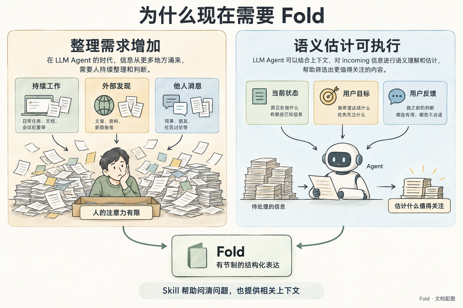
Large title “为什么现在需要 Fold”.
Two balanced columns. Left column heading “整理需求增加”: three source sketches “持续工作”, “外部发现”, “他人消息” feed many small papers toward one person. A modest bounded tray in front of the person is labeled “人的注意力有限”. The growing pile communicates information load without numerical benchmarking or quantitative axis. Right column heading “语义估计可执行”: a tidy Agent workspace compares incoming papers using three explicit context cards “当前状态”, “用户目标”, “用户反馈”. Output a small selected set of notes labeled “估计什么值得关注”.
At the bottom, these two ideas converge toward a single calm Fold card labeled “有节制的结构化表达”.
Footer sentence exactly “Skill 帮助问清问题,也提供相关上下文”.
Do not show a perfect truth oracle, a fixed numerical scoring formula, or promise that previous software could never sort information. Right-side estimate should be visibly contextual, not automatically correct. No new marketing slogans.
08-budget-reallocation
text
Primary request: illustrate the exact before-and-after example for story US-03. Large title “板满了,谁来做取舍”.
Three zones: left a neat vertical list of FIVE equal-width labeled item cards under “整理前 · 64”; center an Agent comparison workspace with a new amber card “签证 +24” and a short label “Agent 决定怎样让位”; right a neat list under “整理后 · 64”. Treat these as listed allocations, NOT literal proportional area charts.
Left list EXACT values in this order: “周报 24”, “PR 16”, “机票 12”, “账单 8”, “阅读 4”.
Right list EXACT values in this order: “签证 24”, “周报 12”, “PR 12”, “机票 8”, “账单 8”.
A small archive pocket below the right list labeled “阅读:暂离当前层” and “内容与原因可查”. Do not delete or burn the reading note.
Under center a compact calculator strip with exact equation “12 + 4 + 4 + 4 = 24”. At the bottom show a simple rule-check card with caption “脚本检查预算,Agent 判断取舍”.
Small note “数值是本次示例,不是固定策略”.
All numbers and totals must be exact. No additional entries, no literal grid, no automated eviction icon, no unsupported urgency symbols.
09-feedback-lifecycle
text
Primary request: explain different stages of human feedback without confusing acknowledgement with completed action.
Title “已读,不等于已办成”.
Main top flow has three large cards from left to right: “批注已保存” showing the exact note “下午我去打印”; “Agent 后来读取” showing the same note next to current task facts; “展示已调整” showing a visa card with exact summary “等你补齐流水”.
Use distinct thin arrows between these three stages. Under the first card a short caption “留言留存”; under second “获得新背景”; under third “反映当前事实”.
A separate bottom branch from the middle card shows another example note “请帮我预约”, then a small task execution workspace labeled “外部行动”, then a gate labeled “实际结果确认”, then a final record “才可报告已办成”. It must be visually a CONDITIONAL separate branch, not a claim that saving a message automatically books something. The branch label is “如果还包含行动”.
Footer “保存、读取、展示调整、行动结果分别记录”.
Keep top printing story distinct from optional bottom booking example. No success checkmark on saving or reading that could mean the booking is done. No implied automatic scheduler.
10-shared-state-conflict
text
Primary request: a simple illustrated sequence diagram of two Agents using a shared state without losing updates. This is a candidate protocol, not implemented software.
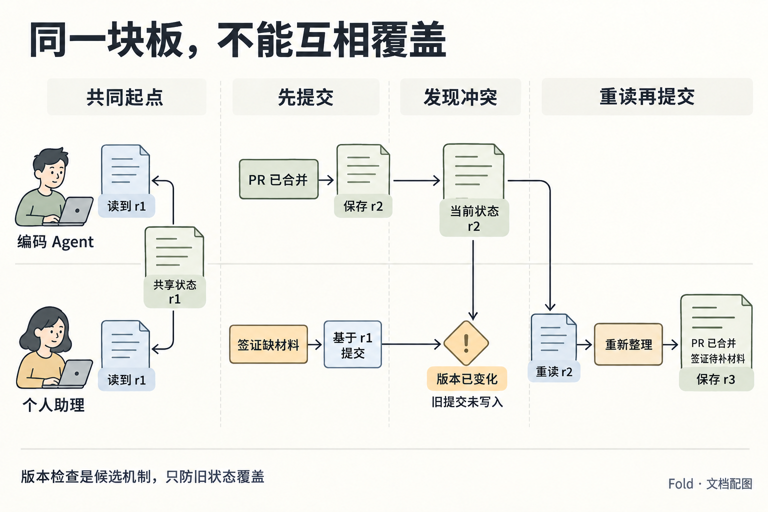
Title “同一块板,不能互相覆盖”.
Across top, four stage headings: “共同起点”, “先提交”, “发现冲突”, “重读再提交”.
Two lanes marked “编码 Agent” and “个人助理”. At the shared beginning, both receive cards labeled “读到 r1”. In the coding lane show “PR 已合并” followed by an arrow to a shared state card labeled “保存 r2”.
In the personal-assistant lane a card “签证缺材料” leads to “基于 r1 提交”; a labeled gate next to current r2 returns “版本已变化”. Do NOT show this stale submission writing over r2.
Then an arrow from the current shared state to the personal-assistant lane labeled “重读 r2”, then “重新整理”, then a shared card “保存 r3”. Final r3 contains two short lines: “PR 已合并” and “签证待补材料”.
At bottom exact note “版本检查是候选机制,只防旧状态覆盖”.
No winner/loser priority ranking. Do not draw automatic merging or unrestricted permission to edit each other's tasks. The two factual updates survive in the final shared state.
11-incoming-vs-committed
text
Primary request: distinguish input observations from accepted state-change events, including the validation boundary.
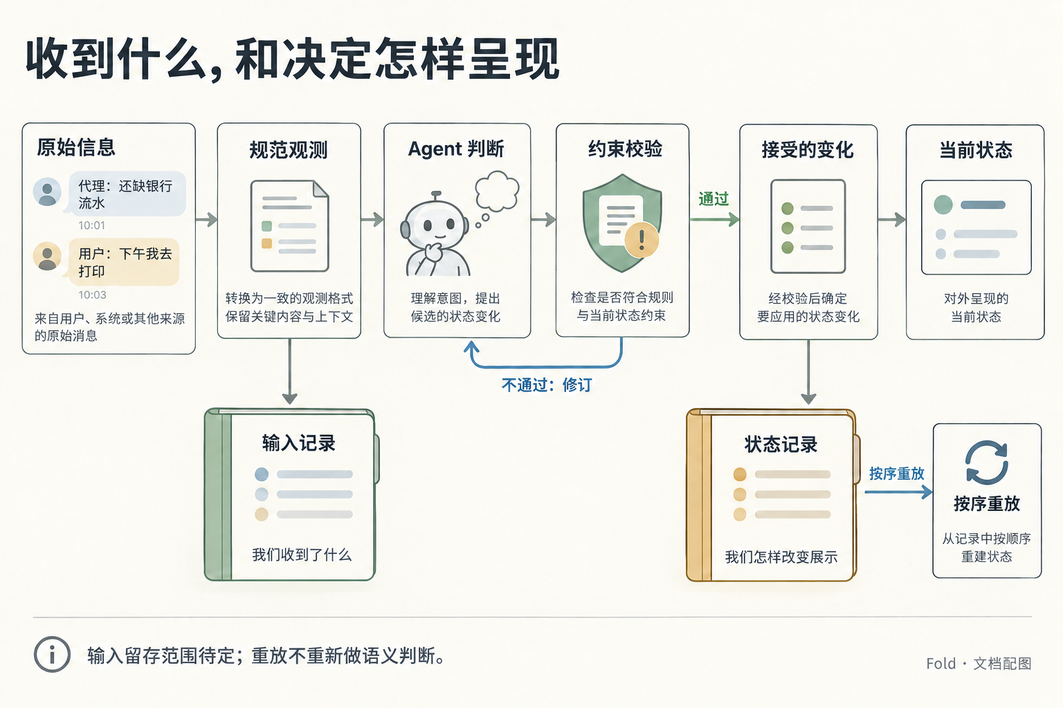
Title “收到什么,和决定怎样呈现”.
Main left-to-right pipeline: “原始信息” illustrated as two messages, then “规范观测”, then “Agent 判断”, then “约束校验”, then “接受的变化”, then a compact state card “当前状态”.
A small labeled return arrow from the check gate back to the Agent workspace says “不通过:修订”. It must NOT pass into the accepted changes or current state.
Below the observation card, a separate ledger labeled “输入记录” with short caption “我们收到了什么”. Below the accepted changes, another separate ledger labeled “状态记录” with caption “我们怎样改变展示”.
From the state ledger draw a short loop back to a state card labeled “按序重放”. Do not draw the input ledger directly into replay.
Bottom note “输入留存范围待定;重放不重新做语义判断”.
The two ledgers are separate visual objects, with clear provenance arrows. A normalized claim must not get a truth-certified checkmark. No implication that all original messages are archived indefinitely.
12-consistency-comparisons
text
Primary request: illustrate two different consistency tests for an LLM-based information-organizing skill.
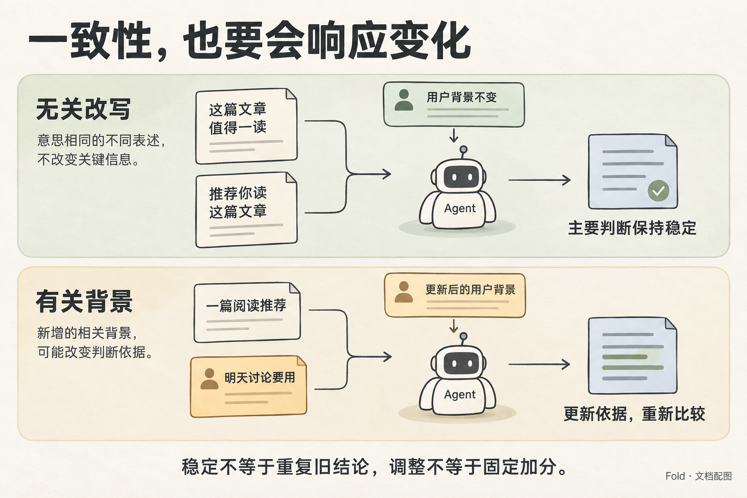
Title “一致性,也要会响应变化”.
Two horizontal lanes, with an input comparison and its expected behavior in each.
Upper lane heading “无关改写”: two same-fact notes, one labeled “这篇文章值得一读”, the other “推荐你读这篇文章”; arrows into one Agent comparison workspace. A small shared context card above says “用户背景不变”. Output caption “主要判断保持稳定”. The two inputs must look like equivalent wording, NOT two simultaneous events that need merging.
Lower lane heading “有关背景”: one original note “一篇阅读推荐” plus an amber new user note “明天讨论要用”. Arrow into the same kind of Agent workspace, now with updated context. Output caption “更新依据,重新比较”.
Bottom exact sentence “稳定不等于重复旧结论,调整不等于固定加分”.
No numerical scores, no claim that all runs must be identical, no guarantee the article always becomes highest priority. Keep a clear visual contrast between phrasing variation and meaningful new background.
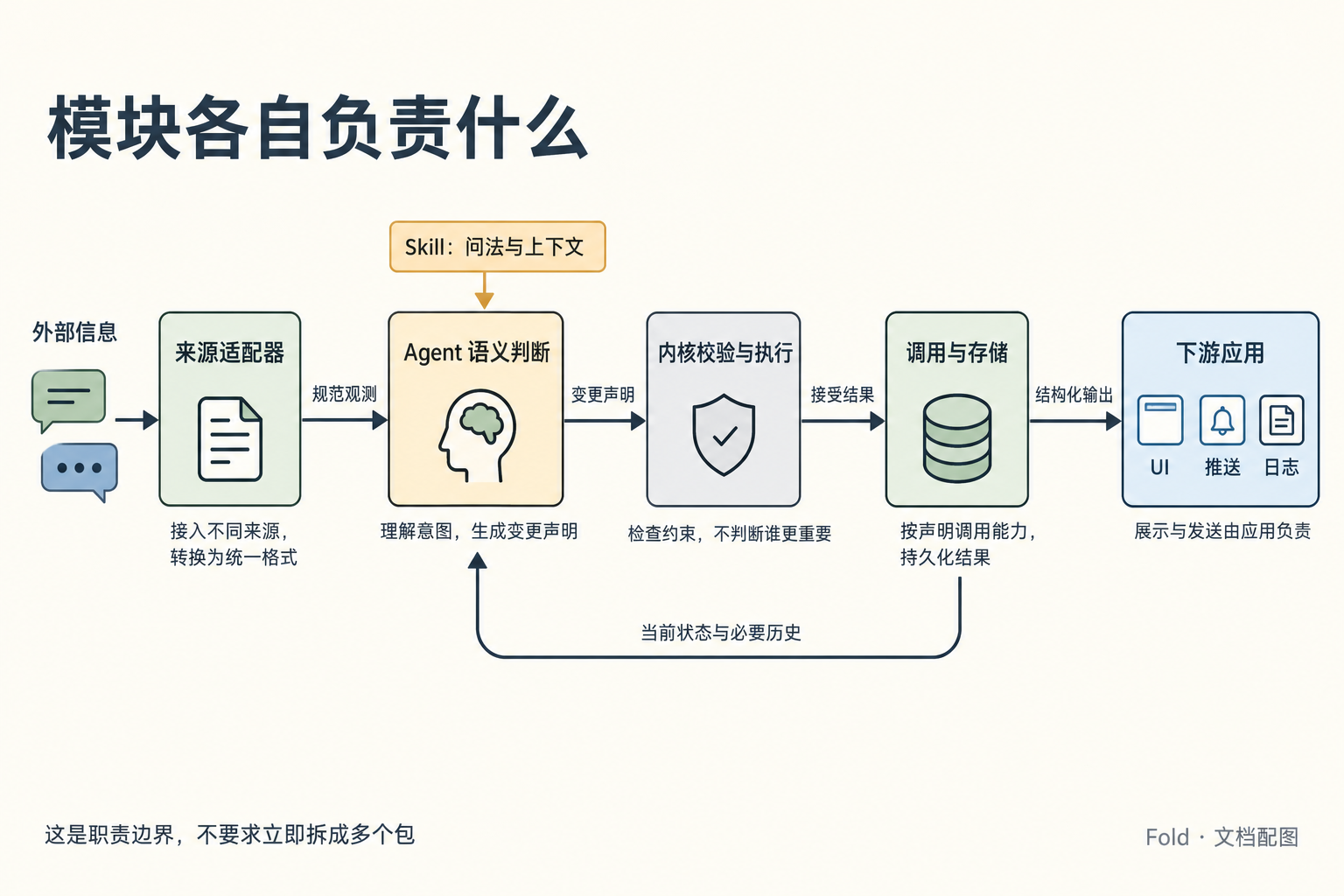
13-module-boundaries
text
Primary request: a precise but approachable module-responsibility diagram for the architecture document.
Title “模块各自负责什么”.
Use distinct bounded modules with unambiguous labeled arrows, not a product screenshot.
Main path: a pair of message icons labeled “外部信息” enters a box “来源适配器”, which emits “规范观测” into a box “Agent 语义判断”. Next arrow labeled “变更声明” points into a separate light-gray box “内核校验与执行”. The next arrow labeled “接受结果” points into a separate box “调用与存储”. Then arrow “结构化输出” leads to “下游应用”, containing three small icons labeled “UI”, “推送”, “日志”.
Place a lower loop FROM “调用与存储” TO “Agent 语义判断”, labeled “当前状态与必要历史”. A small amber note above Agent says “Skill:问法与上下文”.
Under the kernel box, a small exact caption “检查约束,不判断谁更重要”. Under downstream box “展示与发送由应用负责”. Do not put file or network icons inside the kernel box, and do not show the kernel directly sending a message.
Footer “这是职责边界,不要求立即拆成多个包”.
Legibility is more important than decorative detail. Preserve arrows and exact responsibilities; keep the state-feedback loop separate from the left-to-right output path.
14-design-status
text
Primary request: a visual reading key for a design decision document, making the status of statements unmistakable.
Title “这些内容,效力不同”.
Three parallel columns, no progress arrows between them.
Left column in sage green titled “已对齐方向”. It contains three note cards labeled “输入可泛化”, “Agent 做判断”, “输出结构化”. Beneath them: “指导后续设计”.
Middle column in pale amber titled “待定提案”. Cards labeled “字段与尺度”, “提交方式”, “技术栈”. Beneath them: “用具体场景继续收敛”.
Right column in pale blue titled “历史参考”. A preserved paper folder labeled “设计草案 v0.3”. Two notes “保留原始背景” and “旧规则需重新讨论”. Beneath them: “不是当前默认要求”.
Bottom exact sentence “方向已对齐 ≠ 接口已冻结”.
No “approved”, “implemented”, checkmarks implying tests passed, countdown, mandatory approval gate, or arrow from proposal to automatic approval. This is a classification of current design material, not a release workflow.
15-development-workflow
text
Primary request: a concrete developer onboarding illustration of the actual current repository commands.
Title “先把工作环境准备好”.
A left-to-right workflow with three main stages.
Stage 1: a repository folder labeled “Fold 仓库”, small files “文档”, “脚本”, “配图”.
Stage 2: a clean terminal-like command card showing exactly “make setup”, an arrow to a local folder exactly “.venv/”. Caption “建立本地辅助环境”.
Stage 3: a command card showing exactly “make check”. It branches into a paper labeled “scripts/check.py”, with three readable checks “启动文件”, “本地链接”, “基础格式”, plus a separate command strip exactly “git diff --check”.
Keep code strings correct, large, monospace.
At bottom two clear notes: “当前是仓库材料检查” and “产品功能与技术栈仍待确定”.
Do not show remote servers, dependency downloads, deploy buttons, production test passes, or an implemented Fold application. Make setup and check a sequential workflow, not a claim these commands implement the product.
16-two-agent-guides
text
Primary request: explain to new repository collaborators the difference between AGENTS.md and the future Fold SKILL.md.
Title “两份说明,服务两种角色”.
Two parallel panels, with no generation arrow between them.
Left panel sage green: heading “AGENTS.md”; status label “已存在”; a small illustration of a developer working with a repository folder and tools. Main role label “建设 Fold”. Two notes “读设计与决策” and “修改并检查仓库”.
Right panel pale blue with a lightly dashed paper outline: heading “未来 SKILL.md”; status label “尚未实现”; an illustration of an assistant reading incoming information beside a human's context note and arranging report cards. Main role label “使用 Fold”. Two notes “结合用户语境估计” and “整理结构化汇报”.
Bottom exact sentence “开发协作约定与产品使用指引,各有职责”.
No implication that SKILL.md already exists or has been installed. Do not portray AGENTS.md as a user notification tool. No code instructions beyond the two filenames.
07–16 的定向修订
使用对应初稿作为编辑目标,由内置 image_gen 修订,保持不透明背景。09 去掉无关的具体日期,10 校正读状态与版本比较的箭头,11 将输入消息换成文档中的签证情境。
09-feedback-lifecycle
text
Use case: text-localization.
The referenced image is the edit target. Change exactly one line in the top-middle panel: replace “当前时间:4月24日” with “时间:本轮读取时”. Keep every other word, arrow, illustration, panel, color and layout unchanged. Do not introduce any other calendar date. This is a generic explanatory example.
10-shared-state-conflict
text
Use case: precise-object-edit.
The referenced image is the edit target. Preserve the layout, all versions r1/r2/r3, all labels, people, colors and boxes. Correct only the directions of three existing arrows:
1. In the leftmost “共同起点” column, the two arrows connecting the green shared-state r1 page and the blue “读到 r1” pages must point FROM the shared-state page TO the two blue read copies. Remove the two arrowheads pointing into the shared state and put the arrowheads at the blue read copies. This means reading, not writing.
2. In the “发现冲突” column, reverse the vertical arrow between green “当前状态 r2” and the amber diamond. It must point FROM current r2 DOWN into the version-check diamond, because that check reads the current version. It must not point from the stale submission into the current state.
3. Add a small line of text directly below “版本已变化”: “旧提交未写入”. Keep the existing separate arrow from current r2 to “重读 r2”, and the remainder of the retry path, unchanged.
Do not alter the sequence: coding Agent saves r2; assistant's old r1 submission is rejected; assistant rereads r2 and saves r3 with both facts. No other changes.
11-incoming-vs-committed
text
Use case: text-localization.
The referenced image is the edit target. Keep all diagram structure, labels, ledgers, arrows, colors and layout unchanged. Replace only the two message texts in the far-left “原始信息” box:
- replace “今天天气怎么样?” with exactly “代理:还缺银行流水”
- replace “把首页标题改成产品文档” with exactly “用户:下午我去打印”
Allow those messages to wrap into two short lines inside their original bubbles. Keep the timestamps and the rest of the image unchanged. The new examples match the visa-materials story and must not imply that the printing has already happened.
05 的叙事层级修订
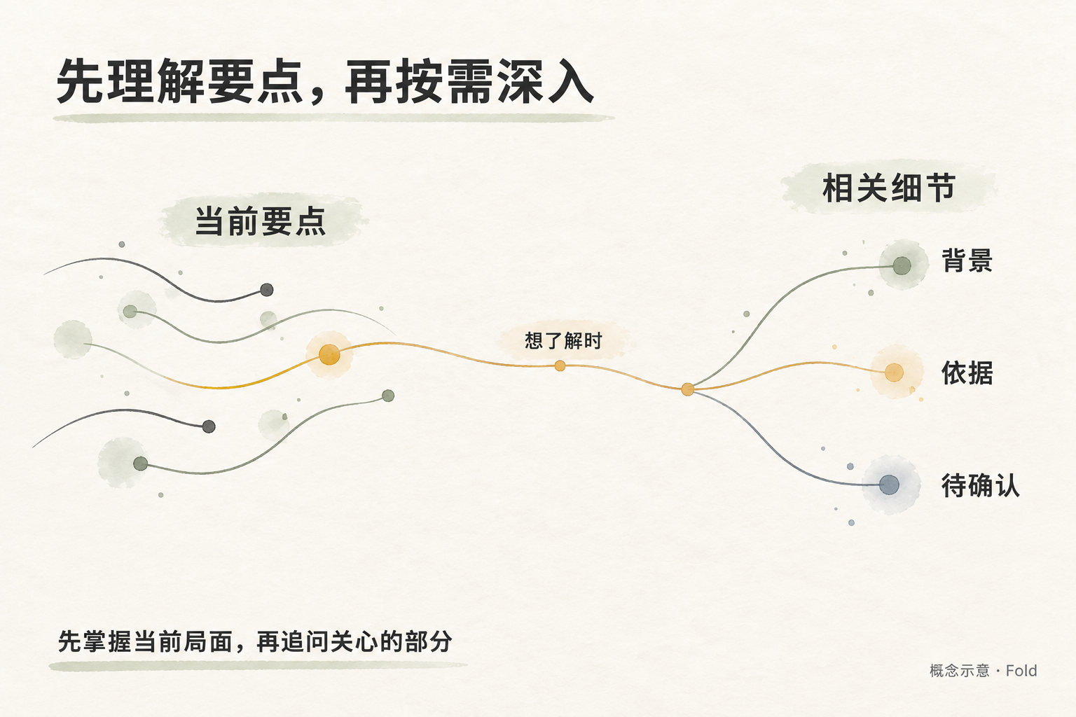
产品介绍先解释怎样理解信息,再在具体场景中介绍应用形态。新版取消预算数字、矩形面积与看板,改用要点和相关细节之间的抽象联系;它说明按需深入,不承担预算比例的演示。
生成方式:内置 image_gen;以已检查的旧版 05 为编辑目标,仅延续纸张、线条与配色,整体重绘构图,保持不透明背景。完整调用提示词如下。
05-attention-and-detail
text
Use case: conceptual-editorial-illustration.
Image 1 is the illustration to redesign. Keep only its warm off-white paper, subtle ink texture, muted sage, amber and slate palette, and clear Simplified Chinese typography. Completely replace the content and composition.
Primary request: a gentle, abstract introductory illustration for Fold, a general system that helps people understand important information and access relevant detail. The previous two square budget boards incorrectly made it look like a Pinboard application. The new image must express a way of understanding information, without depicting any application, interface, physical board or layout allocation.

A spacious wide landscape composition, approximately 3:2. Title at upper left, exact Chinese: “先理解要点,再按需深入”.
Across the middle, draw an airy organic ink-thread composition floating directly on the paper, without panels or enclosing boundaries. On the left, a few short, distinct flowing strands with tiny points suggest a small set of current key ideas, mostly charcoal and sage. One strand has a restrained amber emphasis. Large nearby label: “当前要点”.
From that single amber strand, a fine continuous line gently travels toward the right and branches into three clearly related fine strands. This represents looking more closely into one topic, not copying all input or automatically expanding everything. Along the connecting line, one small readable label: “想了解时”.
The three right-hand strand endings are labeled “背景”, “依据”, and “待确认”, beneath one readable heading “相关细节”. Keep these three labels large enough to read; connect each to its own strand. Their spacing should be organic, never a grid or collection of cards. Use line weight and sparse colored ink marks to distinguish focus from supporting detail, never the sizes of bounded areas. Large open whitespace above and below.
Bottom left, exact short sentence: “先掌握当前局面,再追问关心的部分”.
Bottom right, small standard caption: “概念示意 · Fold”.

This is an abstract explanatory editorial drawing, not a flowchart of software architecture. No squares, rectangles, grids, tiles, cards, boards, tables, treemaps, panels, screens, windows, phone frames, cursor, buttons, UI controls, dashboards, paper stacks, people, robots, desks, books, cups, plants, buildings, landscapes, decorative background objects, budgets, numerals, percentages, formulas, proportional areas, completion checkmarks, or source-to-output funnels. Do not reuse any of the old words about visa, report, PR, budget 64, 16, 8, or blank 32. Do not imply lossless reconstruction, retrieval of all original information, or an automatic importantness algorithm. Render only the exact text specified above. Quiet, restrained, generous whitespace; concept first, no concrete product metaphor. Opaque background.
首切片审阅后的同步修订(08、09、14、15)
本轮使用内置 image_gen 编辑对应原图,保持不透明背景。08 已按五档映射重绘,替换旧的直接份额示例;09 改为讨论材料场景,并分开 saved、实际读取、acknowledged 与外部行动;14 标明首切片与后续切片的效力;15 同步已选 Python 和尚未实现产品 CLI 的现状。前文提示词保留为生成历史,本节记录当前四张文件的完整编辑提示词。
08-budget-reallocation · 当前修订
text
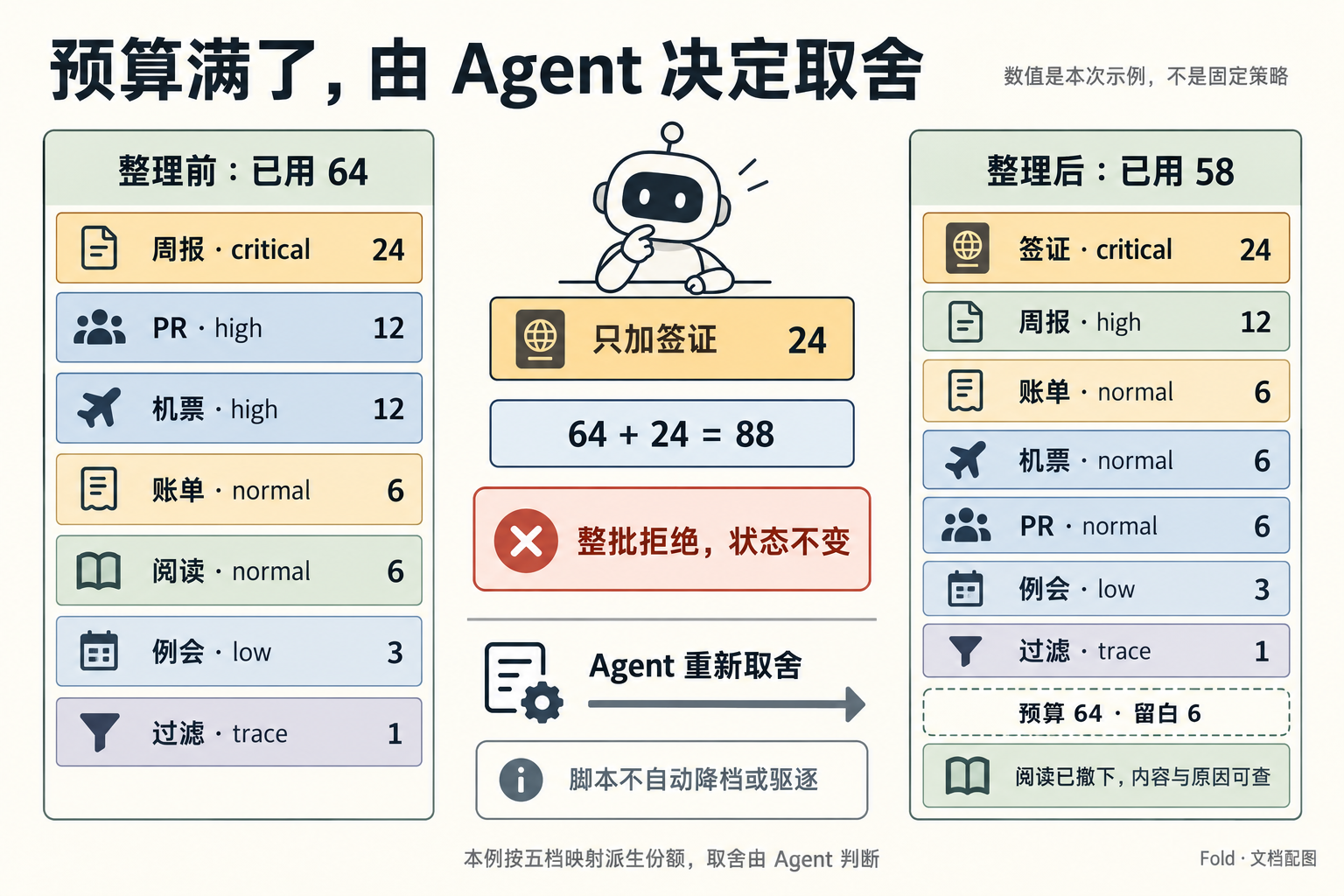
Use case: infographic-diagram. Image 1 is the edit target. Redraw its comparison to match the revised US-03 story exactly, preserving the warm paper, sage/amber/slate palette, readable Chinese typography and calm explanatory style. Opaque 3:2 landscape.
Title “预算满了,由 Agent 决定取舍”.
Use three spacious columns. Left column header “整理前:已用 64”, with exactly seven readable rows:
“周报 · critical · 24”
“PR · high · 12”
“机票 · high · 12”
“账单 · normal · 6”
“阅读 · normal · 6”
“例会 · low · 3”
“过滤 · trace · 1”
These sum to 64. Rows are labels, not proportional area rectangles.
Center upper part shows a simple amber proposal “只加签证 24”, then “64 + 24 = 88”, then a clearly rejected stamp-like statement “整批拒绝,状态不变”. Do not connect this rejected result as a saved state. Center lower part shows “Agent 重新取舍” and a rightward arrow to the right column. Small explanatory note: “脚本不自动降档或驱逐”.
Right column header “整理后:已用 58”, with exactly seven readable rows in this order:
“签证 · critical · 24”
“周报 · high · 12”
“账单 · normal · 6”
“机票 · normal · 6”
“PR · normal · 6”
“例会 · low · 3”
“过滤 · trace · 1”
Below these rows: “预算 64 · 留白 6”.
A separate small note “阅读已撤下,内容与原因可查”.
Footer “本例按五档映射派生份额,取舍由 Agent 判断”.
Remove every old 16, 8, 4, right-side total64 and 12+4+4+4 equation. No extra numerical allocations. Keep the labels and sums exact. No hypothetical product screenshot, no cell grids, no completed visa mark. Bottom corner “Fold · 文档配图”.
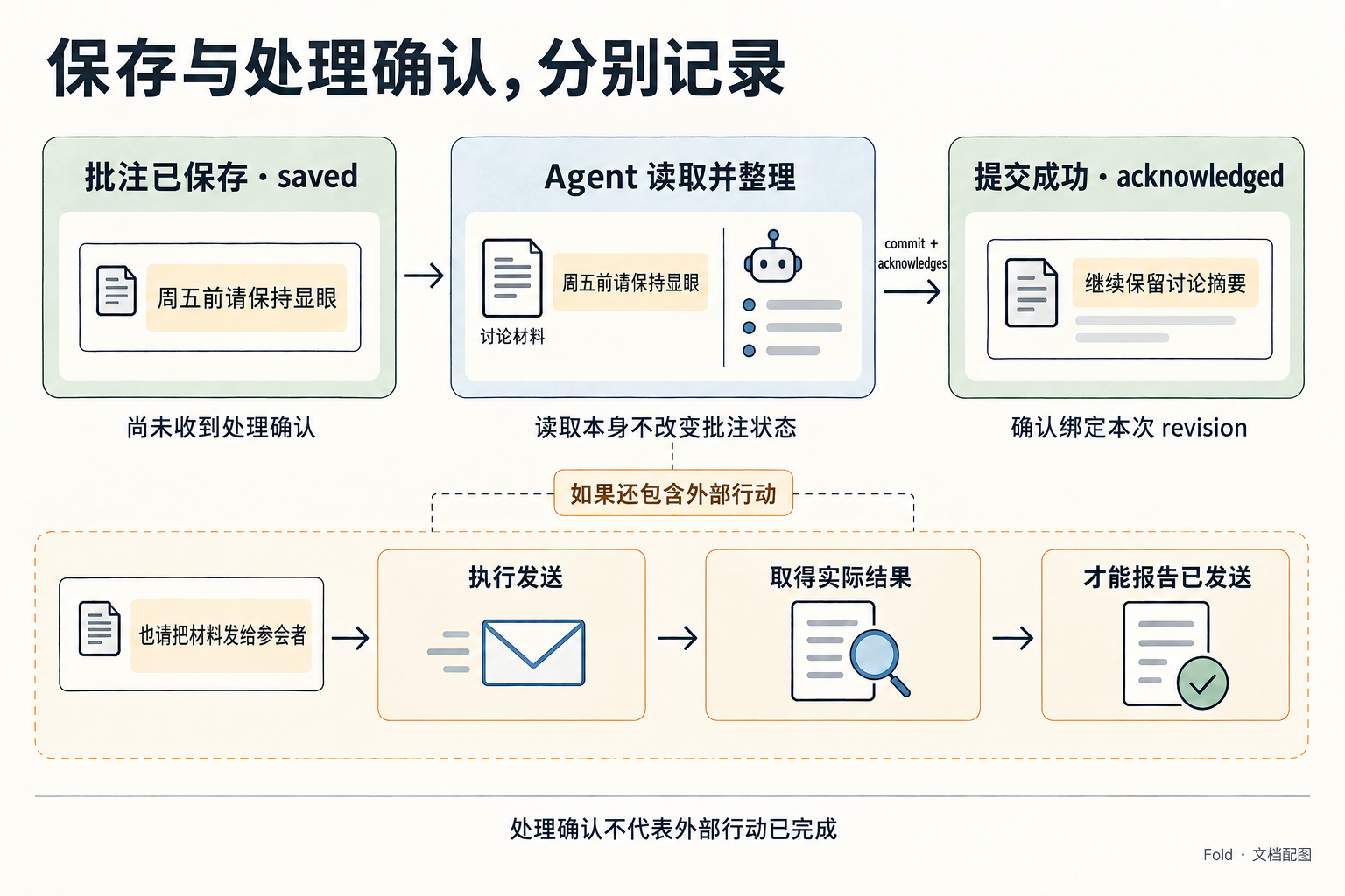
09-feedback-lifecycle · 当前修订
text
Use case: infographic-diagram. Image 1 is the edit target. Replace its visa example with the US-04 discussion-material feedback example, and update the feedback semantics from read to acknowledged. Preserve the warm paper, soft sage/slate/amber and clean wide 3:2 diagram style. Opaque background.
Title exactly “保存与处理确认,分别记录”.
Top row three panels, arrows left to right:
1 header “批注已保存 · saved”. A readable user note “周五前请保持显眼”. Under it “尚未收到处理确认”.
2 header “Agent 读取并整理”. Show the SAME user note next to a simple document “讨论材料”. Below this panel state “读取本身不改变批注状态”.
3 header “提交成功 · acknowledged”. Show a maintained summary “继续保留讨论摘要”. Below it “确认绑定本次 revision”.
The arrow into panel3 must be labeled “commit + acknowledges”. It means confirmation is persisted with a successful submission, not automatically when read.
A separate lower conditional branch begins from panel2, labelled “如果还包含外部行动”. The branch shows user request “也请把材料发给参会者”, then “执行发送”, then “取得实际结果”, then “才能报告已发送”. These are successive steps on one line; keep labels concise and readable. Do not show that submission alone sends anything.
Footer exact “处理确认不代表外部行动已完成”.
Remove all visa/passport/bank statement/reservation text and the old read-status title. Never state that saved proves nobody has read the note. There is no read status: the two persisted statuses displayed are saved and acknowledged. Keep enough whitespace, no microscopic text, no fake fields beyond the specified labels. Bottom corner “Fold · 文档配图”.
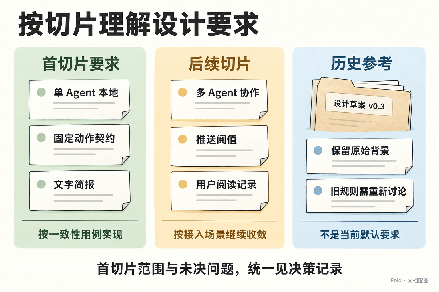
14-design-status · 当前修订
text
Use case: text-localization. Image 1 is the edit target. Keep its three-column paper-card composition, color palette, type sizes and historical folder illustration. Update the text to reflect an agreed first slice, with later work still deferred. Opaque background.
Top title replace with “按切片理解设计要求”.
Left column heading replace with “首切片要求”. Its three cards become “单 Agent 本地”, “固定动作契约”, “文字简报”. Its lower line becomes “按一致性用例实现”.
Middle column heading replace with “后续切片”. Its three cards become “多 Agent 协作”, “推送阈值”, “用户阅读记录”. Its lower line becomes “按接入场景继续收敛”.
Right column heading remains “历史参考”. Preserve “设计草案 v0.3”, “保留原始背景”, “旧规则需重新讨论”, and “不是当前默认要求”.
Bottom slogan replace with “首切片范围与未决问题,统一见决策记录”.
Remove old statements that fields, submission format or technology stack are undecided for the first slice. Preserve all other visual styling and the “Fold · 文档配图” mark. No additional text.
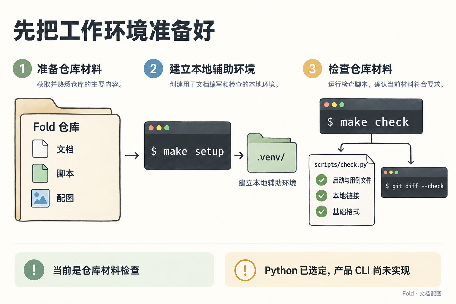
15-development-workflow · 当前修订
text
Use case: text-localization. Image 1 is the edit target. Preserve the complete existing development workflow, arrows, folders, commands, paper palette and typography. Keep the background opaque. Make only these two text edits:
1. Replace the bottom-right sentence “产品功能与技术栈仍待确定” with “Python 已选定,产品 CLI 尚未实现”.
2. On the scripts/check.py checklist, replace “启动文件” with “启动与用例文件”.
Keep make setup, .venv/, make check, scripts/check.py, git diff --check, 本地链接, 基础格式, 当前是仓库材料检查 and every other label unchanged. This figure must not claim that make check executes product conformance tests.
20:把视觉概览落实为具体例子
以下是初版及连线校正的生成记录;其中“卡片面积不编码份额”的构图已被本文末尾的面积修订取代。当前文件以份额决定面积,初版提示词仅保留作历史记录。
生成方式:内置 image_gen,单张新图,不透明背景。此图是文档设计示意,不是 Fold CLI 已生成的业务截图;产品中的状态图仍须以真实页面渲染生成。
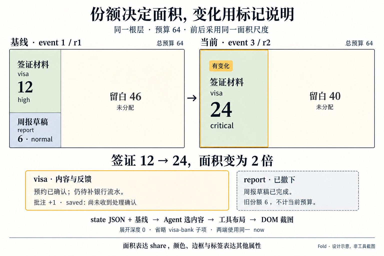
图中数值取自 06-state-overview.yaml:基线 event 1/r1,当前 event 3/r2;签证 high/12 → critical/24,周报旧份额 6 撤下;当前根层预算 64、已用 24、留白 40。批注为 saved,visa-bank 子项因深度为 0 省略。唯一正文位置为信息契约的视觉概览章节。
20-state-overview-diff
text
Use case: infographic-diagram.
Asset type: one concrete explanatory illustration for the Chinese Fold design document, beside the state overview and diff specification. This is a clearly labeled design illustration, NOT an actual screenshot of an implemented tool.
Create a wide 3:2 landscape raster image, opaque warm off-white paper background, fine charcoal outlines, pale sage, restrained amber change highlights, muted slate for JSON and gray for withdrawn history. Match a calm editorial technical documentation style, not a glossy dashboard. Crisp highly readable Simplified Chinese and monospaced JSON, generous margins, no tiny text. No people, robots, mascots, computers, browser chrome, decorative props, cell grids, or fake controls.

Top title exactly: “同一份状态,换一种方式看变化”.

Three connected areas, with the right preview the largest. Left approximately 28%, middle approximately 22%, right approximately 44%, separated by whitespace and thin directional arrows.

LEFT: A paper-like source panel titled “state.json · 节选” showing this EXACT valid JSON snippet with readable indentation:
{
  "revision": "r2",
  "last_event_seq": 3,
  "root": {
    "used": 24,
    "items": [
      {
        "id": "visa",
        "weight": "critical",
        "share": 24
      }
    ]
  }
}
Under this panel, a separate smaller source strip titled “按 event_seq = 1 重放基线”.
It contains exactly “r1 · visa 12 · report 6”.
The baseline is a separate source, never a new field in current state.json.

MIDDLE: The current source and baseline both feed through a clear small vertical process:
“Agent 选择内容”
Then three simple text chips: “根层”, “展开深度 0”, “保留未变上下文”.
Then “工具比较与布局”
Then “HTML → DOM 截图”.
An arrow points from this process to the RIGHT preview. Below the process add the short note “两端使用同一 now”.
Do not draw an arrow returning from the preview to the source. The preview cannot edit state.

RIGHT: A single large clear preview surface titled “overview.png · diff 高亮”.
Header directly beneath: “event_seq 1 → 3 · r1 → r2”.
Budget line: “当前预算 64 · 已用 24 · 留白 40”.
Show an amber-bordered ACTIVE item with:
“签证材料” and a small badge “内容更新”
“visa · active · needs-you”
“预约已确认;仍待补银行流水。”
“high → critical    份额 12 → 24”
A small separated feedback area inside this SAME item:
“批注 +1 · saved”
“下午我去打印,先保留材料要求。”
“尚未收到处理确认”
The current attention share is 24; 12 is the before value. Do not imply that visa is complete or the bank statement was printed. Do not show an acknowledgement badge.

Below, a visibly distinct gray historical card, not counted as an active allocation:
“周报草稿 · report”
“周报草稿已完成。”
“已撤下 · 旧份额 6 · 不计当前预算”
Use a dashed border or gray surface, AND the explicit text, so the meaning does not depend only on color. Keep it visible as a diff marker, not a deleted or missing item.
At the bottom of the preview:
“省略 1 项细节:visa-bank”
Do not show that child as an extra root-budget allocation. Cards are content containers, not a proportional area chart. No additional entries or invented numbers.

Across the bottom of the full illustration, concise statement:
“同源数据,两种表达;只改变呈现,不改写 state”.
Bottom-right small label:
“Fold · 设计示意,非工具截图”.

All sums and labels must be exact. There is one active root item visa=24 and one withdrawn historical marker report old=6. Root budget remains64, used24, blank40. One omitted child is visa-bank, not another root item. The document example corresponds to the overview conformance scenario. No language suggesting the PNG can reconstruct every JSON field, no generated new facts, and no implication that a product renderer is already implemented.
20 的连线校正
保留全部内容,仅纠正流程连线:基线进入比较,概览图由 DOM 截图步骤输出,不从内容选择直接跳到图片。
text
Use case: precise-object-edit. Image 1 is the edit target. Preserve EVERY existing label, number, JSON line, card, font, color, background and the entire composition exactly. Change ONLY the connector arrows to make the existing process truthful. This is a documentation diagram; opaque background.
1. Remove the horizontal arrow that currently goes directly from the right edge of the top middle “Agent 选择内容” box into the right “overview.png” panel. There must be NO direct selection-to-preview arrow.
2. Keep the current arrow from the state.json panel into Agent 选择内容, and keep the two vertical arrows from Agent 选择内容 down to 工具比较与布局 and then down to HTML → DOM 截图.
3. ADD a connector from the separate bottom-left “按 event_seq = 1 重放基线” strip into the LEFT edge of the middle “工具比较与布局” box. Route a thin charcoal elbow line through the empty vertical gutter between the source and the middle boxes, without crossing any panel or text. Arrowhead must point INTO 工具比较与布局. This supplies the baseline to the comparison.
4. ADD a short horizontal right-pointing arrow from the RIGHT edge of the bottom-middle “HTML → DOM 截图” box into the LEFT OUTER edge of the large right overview.png panel. Arrowhead at the overview panel boundary. It must be clear that the preview is the OUTPUT of actual rendering.
No other changes. Do not add text or new arrows. In particular do not change the large title, the current budget64 used24 blank40, event_seq1→3/r1→r2, visa12→24/high→critical, saved note, report withdrawn oldshare6, omittedvisa-bank, or bottom design-illustration label.
20 的份额面积修订 · 当前版本
使用内置 image_gen 编辑既有配图,保持不透明背景。预算区域中,份额必须与面积对应;前后根层预算同为 64,基线签证 12、周报 6、留白 46,当前签证 24、留白 40。签证面积翻倍,详情和撤下标记移到预算区域之外,不用内容长度改变份额面积。生成配图近似表达面积关系,不作为像素级比例验收结果;产品实现须按信息契约精确布局并测量 DOM 几何。
text
Use case: infographic-diagram. Image 1 is the illustration to revise. Preserve its warm off-white paper, dark crisp typography, restrained sage / slate / amber palette, and the same concrete Fold example. Completely redesign the composition so ACTUAL RECTANGLE AREA visibly and quantitatively encodes attention share. The previous equal-width content cards are wrong for this task.
Output an opaque, wide 3:2 landscape image, approximately 1536x1024. Clear large Simplified Chinese. This is a DOCUMENT DESIGN ILLUSTRATION, not a real implemented screenshot. No browser chrome, fake buttons, people, devices, decorative props, cell grids or extra items.

Top title, exactly:
“份额决定面积,变化用标记说明”
Subtitle:
“同一根层 · 预算 64 · 前后采用同一面积尺度”

MAIN COMPOSITION: TWO LARGE BUDGET RECTANGLES side by side, EXACTLY equal width and height. Their outer headers and captions must be OUTSIDE the proportional rectangle. The left is the baseline and the right is current. Each rectangle represents the full budget 64, INCLUDING real unallocated blank area. Blank area must not disappear or be just a label. Rectangles should be about 640 wide by 384 high each, if the output is 1536x1024. Use thin dividers, no wide gutters. No internal square grid.
For an exact geometry guide, view EACH budget rectangle as coordinates 0..640 in x and 0..384 in y.

LEFT header: “基线 · event 1 / r1”
LEFT rectangle split:
- First split at x=180: the RIGHT area x=180..640, y=0..384 is warm empty space, label “留白 46” and small “未分配”.
- The LEFT strip x=0..180 is split at y=256.
- TOP LEFT area x=0..180, y=0..256 is pale sage, label “签证材料”, “visa”, large “12”, small “high”.
- BOTTOM LEFT area x=0..180, y=256..384 is pale slate blue, label “周报草稿”, “report”, and “6 · normal”.
Thus the real areas are 12/64, 6/64, and 46/64. The visa area is exactly TWICE the report area. The entire large right blank region is genuine unallocated space.

RIGHT header: “当前 · event 3 / r2”
RIGHT rectangle split:
- At x=240, ONE full-height vertical split.
- LEFT area x=0..240, y=0..384 is pale sage with an inset amber outline indicating changed content, label “签证材料”, “visa”, large “24”, small “critical”, small amber tag “有变化”.
- RIGHT area x=240..640, y=0..384 is warm empty space, label “留白 40” and small “未分配”.
Thus the real areas are EXACTLY 24/64 and 40/64. The current visa rectangle has exactly TWICE the area of the baseline visa rectangle. Do not enlarge any rectangle to fit extra text. There is NO report card anywhere INSIDE the CURRENT budget rectangle.

Between the two boards, a slim rightward arrow, not a new item. Under the boards, a prominent exact sentence:
“签证 12 → 24,面积变为 2 倍”
Use clear outside-the-board callouts with generous spacing beneath this sentence:
One callout headed “visa · 内容与反馈”
“预约已确认;仍待补银行流水。”
“批注 +1 · saved:尚未收到处理确认”
Another GRAY DASHED historical marker headed “report · 已撤下”
“周报草稿已完成。旧份额 6,不计当前预算。”
This historical marker must be fully OUTSIDE and separated from the two budget rectangles. Its gray dashed treatment is not a new allocation. No return-to-state arrows.

Lower small flow, one line:
“state JSON + 基线 → Agent 选内容 → 工具布局 → DOM 截图”
Small note:
“展开深度 0 · 省略 visa-bank 子项 · 两端使用同一 now”
Footer:
“面积表达 share;颜色、边框与标签表达其他属性”
Bottom-right small mark:
“Fold · 设计示意,非工具截图”

Critical invariants:
- The budget rectangles MUST match dimensions. Baseline18used+46blank=64; current24used+40blank=64.
- Preserve visible empty areas at the specified proportions. Do not normalize active content to fill the board.
- Text, change explanations, feedback and withdrawn markers NEVER enlarge proportional areas.
- Parent and child budgets are independent; do not put visa-bank into these root budget rectangles.
- Actual rectangle AREA, not just a numeric label or decorative mini bar, is the main visual channel.
- The share change 12→24 maps to 2x AREA, not 2x width and 2x height (which would be4x area).
- No extra numbers, false completion claims, or hidden active root items.
20 的面积分界校准
在保持外框与文字的基础上,校准预算矩形内部的分界:基线左栏占 18/64,其中签证和周报按 2:1 分割;当前签证占 24/64。
text
Use case: precise-object-edit. Image 1 is the target. Keep this entire diagram, all text and numbers, palette, typography and all outer boxes. Correct ONLY the three internal budget divider positions and fit their text inside the corrected regions. The last image's partitions are slightly too wide, so the numeric area ratios need correction.
On the existing 1536x1024 image, the baseline outer budget rectangle runs approximately from x=38 to738 and y=197 to591. Keep it fixed. Move its internal VERTICAL divider from x≈264 to x≈235, exactly 28.125% of the full rectangle width from its left edge. Move its left-strip HORIZONTAL divider from y≈444 to y≈460, exactly two-thirds of the full rectangle height from its top. This makes visa area 12/64, report area6/64 and blank46/64. The visa area must be exactly twice report area. Keep labels inside; the baseline report text may be recentered or made slightly smaller to fit the corrected box, but never enlarge its geometry.
Keep the current outer budget rectangle fixed at approximately x=799..1498,y=197..591. Move its internal VERTICAL divider and the right edge of the amber visa outline from x≈1088 to x≈1061, exactly37.5% of its full width from the left. The remainder is62.5% blank. Thus visa24/64 and blank40/64; the current visa has twice the area of baseline visa.
All outer rectangles remain equal size. Preserve all labels:12,6,46,24,40,budget64; no new text. No changing the callout boxes, arrow, headings, footer, or outside historical marker. Opaque background. The intended correction is precise geometry, not creative reinterpretation.